These posters are a distant relation to the sleek marketing records that promoted Kneehigh’s productions in the early 2000s and beyond.

Archivist’s Choice
Archivist’s
Choice
Sarah C Jane, Falmouth University’s Archivist, shares her pick from This is Kneehigh. Surely an impossible task?
A poster paints a thousand words
They say that you shouldn’t have favourite children. But should Archivists have favourite collections? Favourite items within a collection? As much as we professionally aspire to be neutral facilitators of other people’s use of the records in our care, there are certain items that can’t help but grab at your belly and tickle your insides. Much like a Kneehigh Show. So for me, its perhaps no surprise that many of my ‘favourite’ things are held within our Kneehigh Archive. And what a privilege it is to be able to share them with you here
“it has often
times felt
like the archive held a great secret.”
Sarah, Kneehigh Archivist
Since the Collection was first deposited with us back in 2010, I have been struck by how much the visual identify of the Company changed since its foundation in 1980. Kneehigh’s brand was latterly so strong – the distinctive voice, courier style font and of course that alluring spark of inspiration above the ‘i’ – that it has oftentimes felt like the archive held a great secret: while much of the ethos of the work remained unchanged over its 40 years, the Company didn’t always look this way. These four decades saw a great evolution in how Kneehigh was presented to the public, with the earliest iterations of the Company brand being almost unrecognisable to even the most devoted Kneehigh fan.
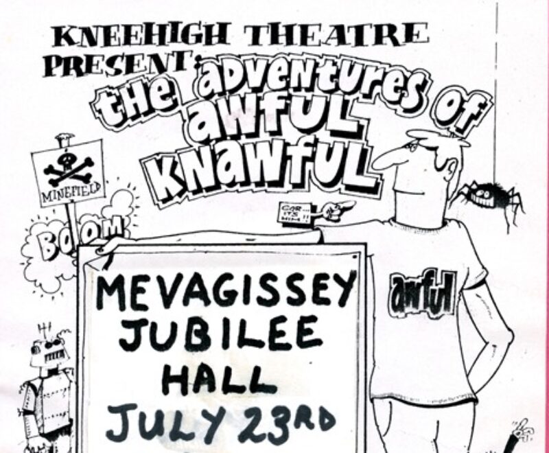
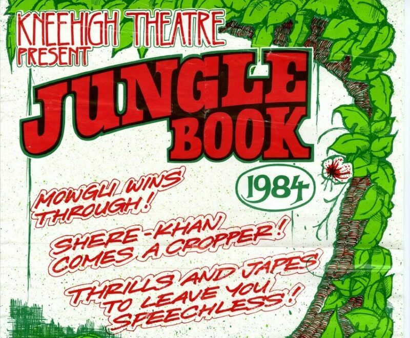
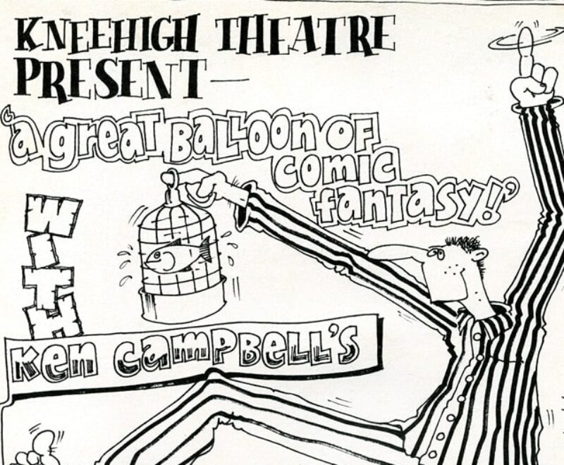
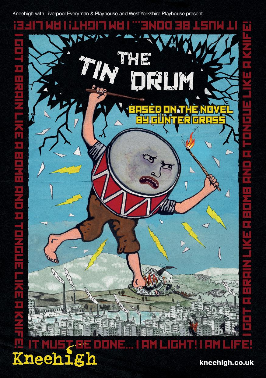
Nothing represents the development of Kneehigh’s visual identity, and the growth of the Company into an international tour de force, better than the Kneehigh posters. The earliest shows were promoted using the illustrative, hand-drawn style of graphic designer Dave Mynne. Resonant of Children’s TV shows of the era, complete with short trousers and knobbly knees, Mynne’s informal and engaging style represented the innovative approach to community theatre that shaped Kneehigh’s beginnings.
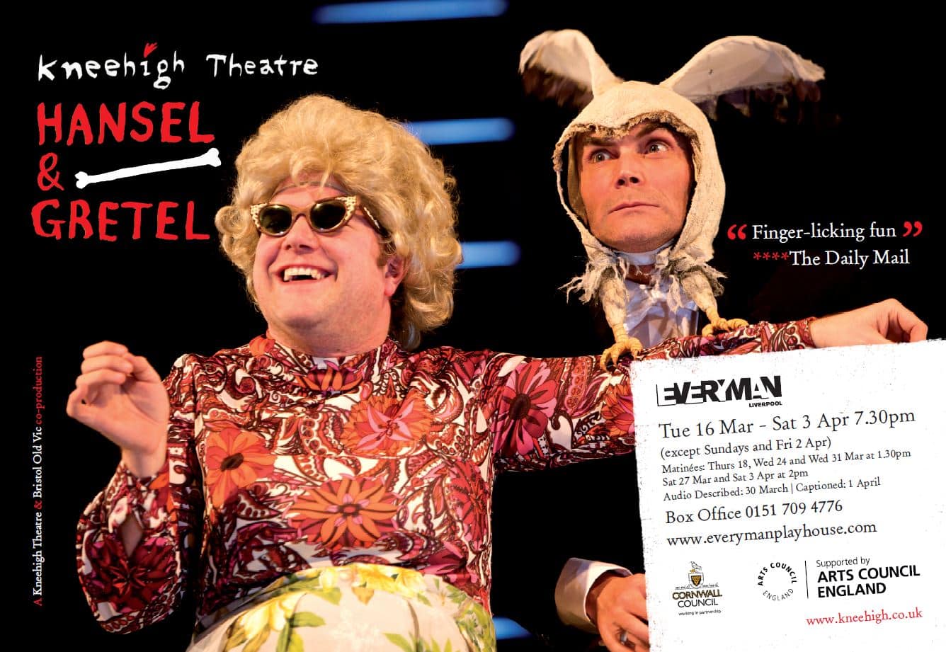
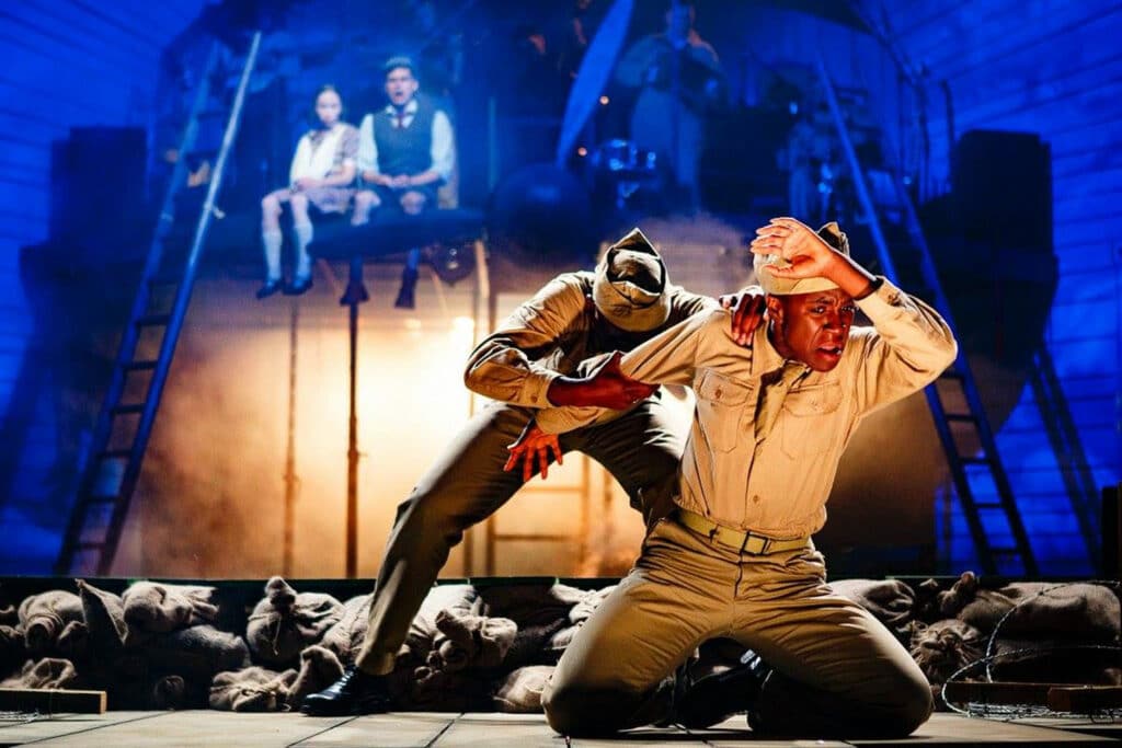
Polished, structured, littered with press praise and often featuring the work of photographer and long-time Kneehigh collaborator Steve Tanner, these records illustrate Kneehigh’s journey from Cornish harbour to Broadway stage in the intervening years.
If I really do have to choose just one record from this profusion of visual delights, it would be this poster for Kneehigh’s Scrooge (1993).
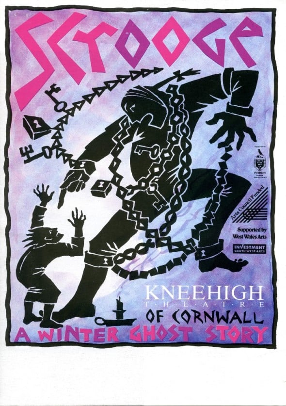
Poster for ‘Scrooge’, 1994
The lino cut shadow-puppet style is typical of designer and actress Sue Hill, who designed many of Kneehigh’s posters of this period. We see the beginnings of a consistent brand, with the regular use of a Kneehigh logo and Sue’s distinctive angular text, but with an artistic freedom that was perhaps lost in
later, more heavily marketed, designs. I love that, in keeping with Kneehigh’s irreverent approach, the design eschews many of the traditional troupes associated with Dickens and a Victorian Christmas: there’s not a sprig of holly to be found. The poster instead features a wintery pallet of blues and purples, often seen in the workbooks of Scrooge’s designer Bill Mitchell, which may be discovered in our Bill Mitchell Archive.
That said, of course, archivists don’t have favourites.
The evolution of Kneehigh’s visual identity was the subject of our online exhibition to mark the Company’s 40th Anniversary and is available to view below or via our archive website.